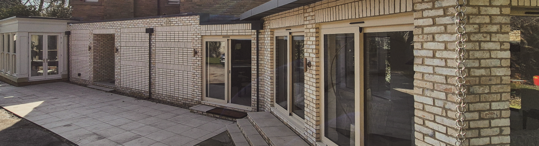
a side extension that became something more.
the client first came to us for a standard side extension. working through the design, we saw the chance to do more, a sun-filled garden pavilion that changes how the whole house is lived in.
featured in The Times under the headline "The Architecture of Luxury", the project reworks how the household moves through its day, taking the family entrance off the grand front facade round to a calmer rear arrival, opening onto a private courtyard.
luxury, in the detail.
01
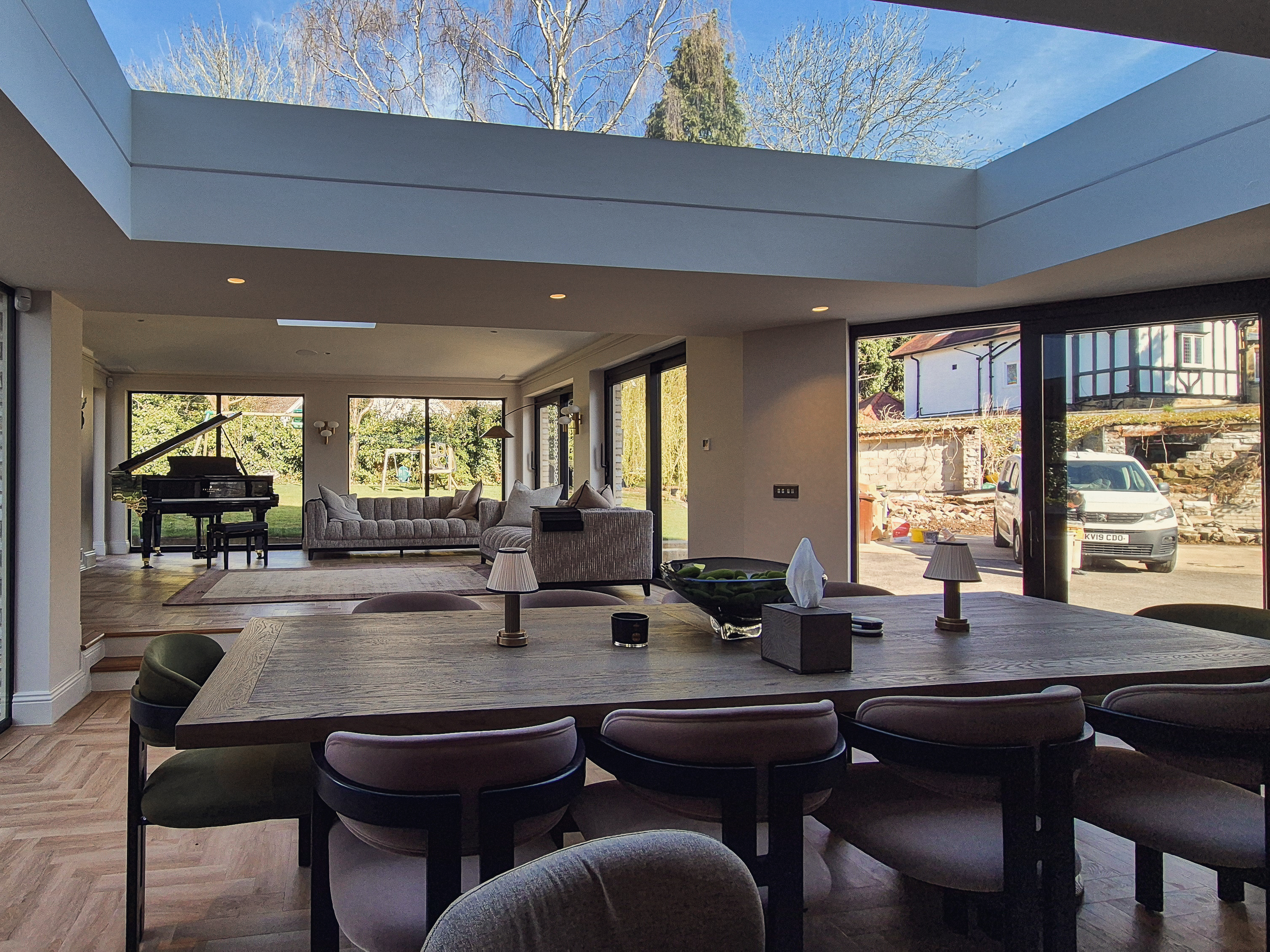
an enormous, dynamic roof light
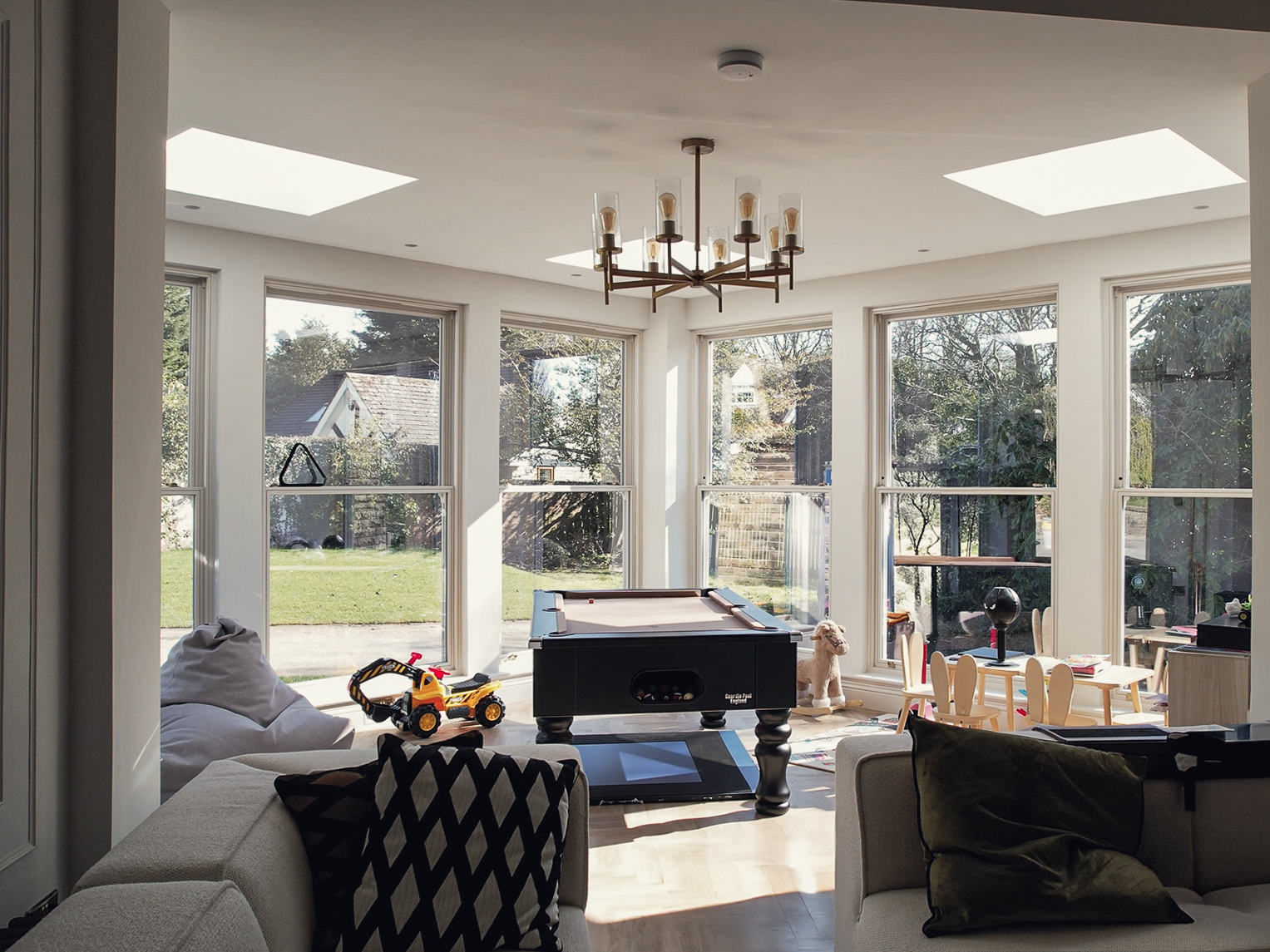
the whole design is built around light. a large central rooflight sits in the roof, and the living spaces fill with daylight that shifts through the day across the masonry and the finishes.
02
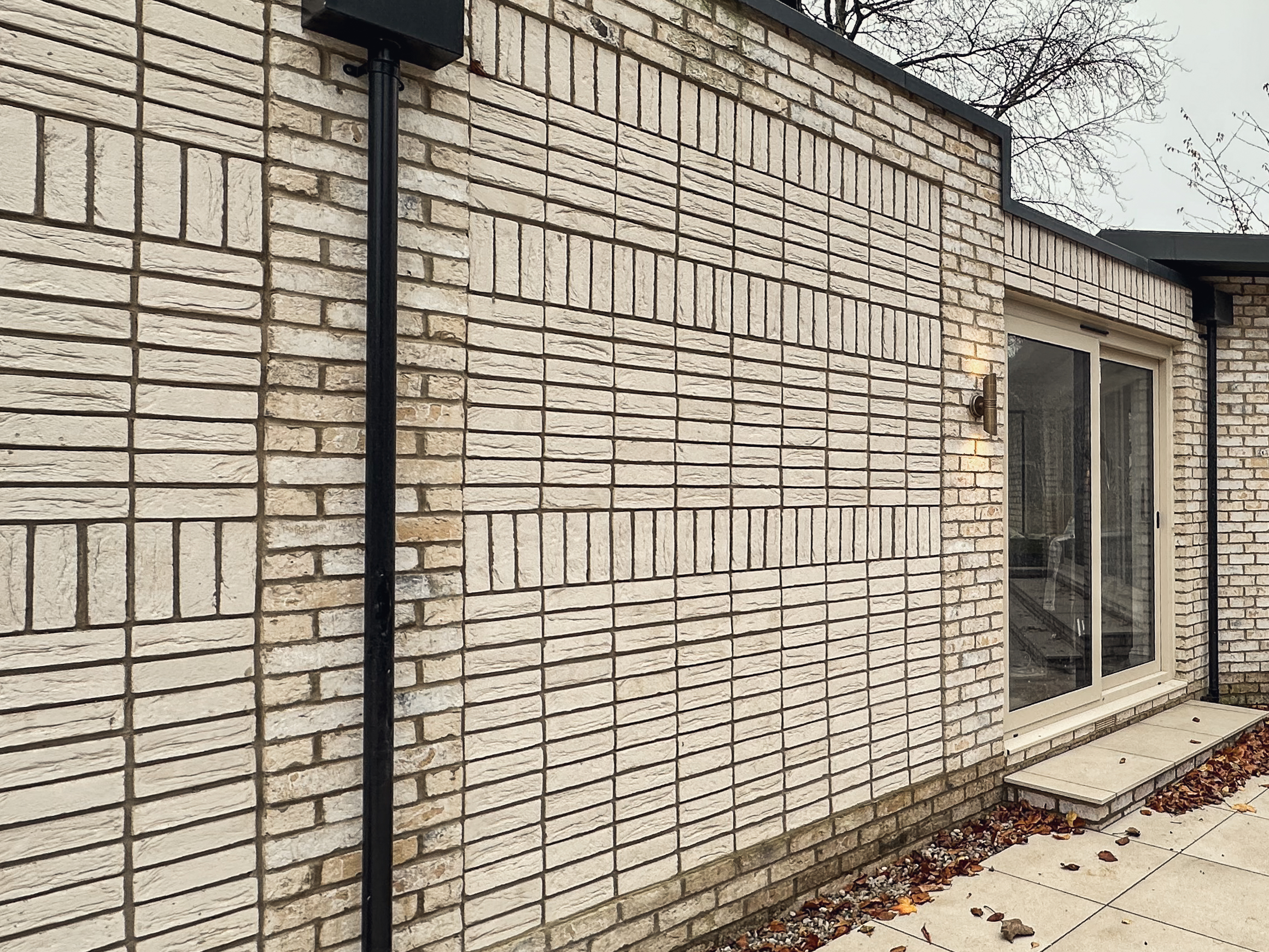
brickwork that reads the original house
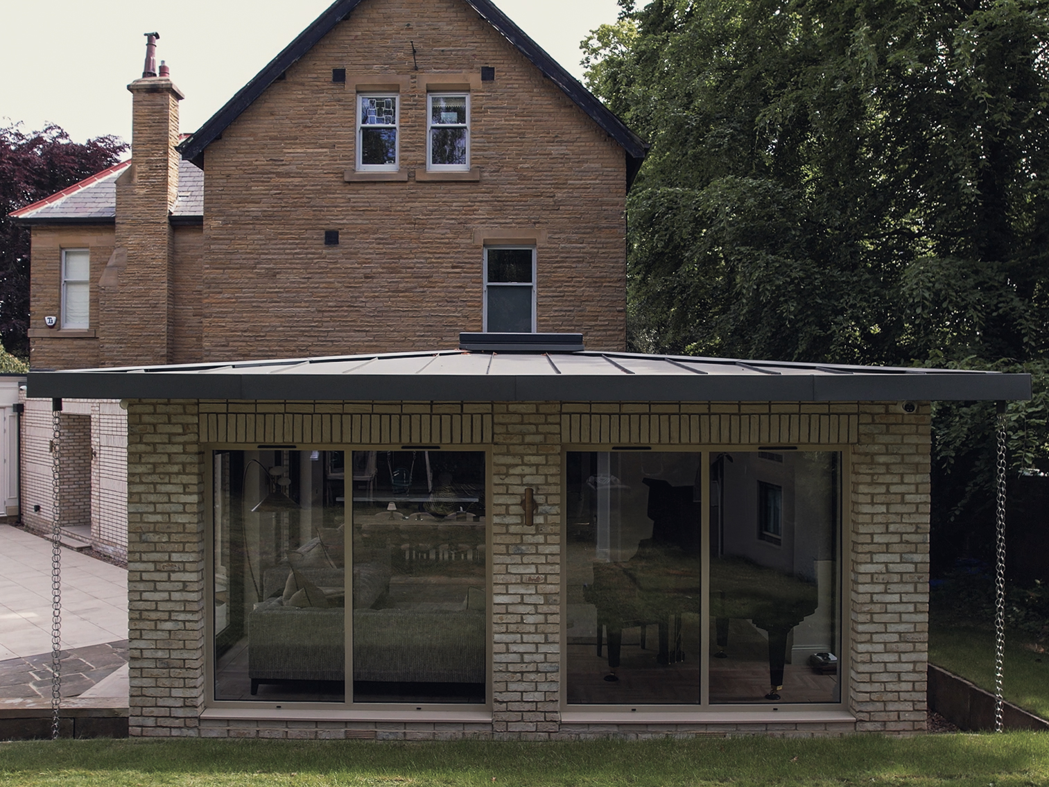
the masonry is a deliberate response to the original building, where large stone blocks at eye level gradually give way to smaller, brick-scale coursing as they rise. the extension retells that shift: vertical stacked-bond panels mark the transition, and the bands of brick between them reduce course by course as the wall climbs — a gradient in the bond itself that turns a long boundary wall into something sculptural.
03
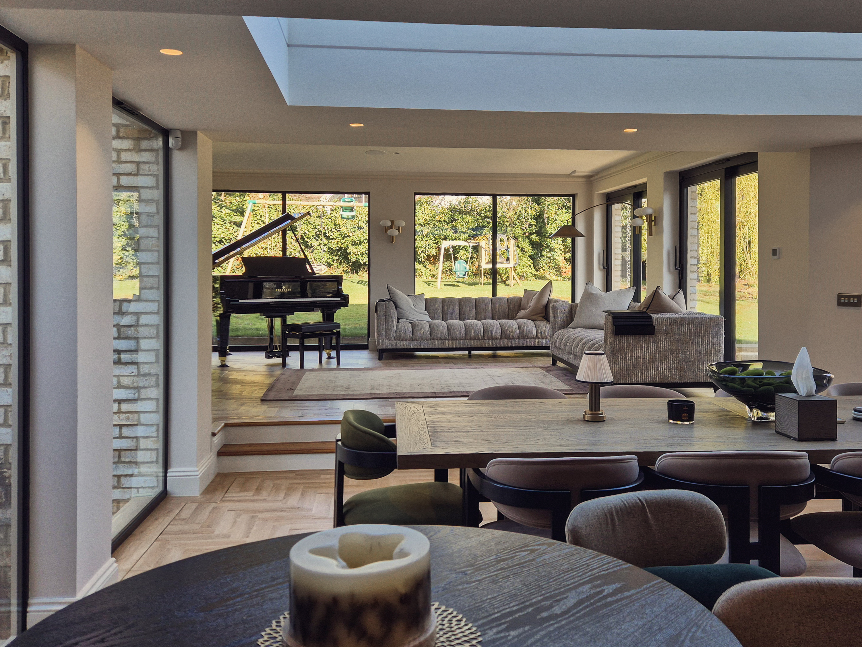
the “pavilion feel” indoor-outdoor flow
to get the open feel of a pavilion, the extension uses large-format sliding glass doors in a soft, colour-matched neutral. the glazed bays open the lounge onto the courtyard and let the garden read as part of the room.
04
an award-winning kitchen by grid thirteen
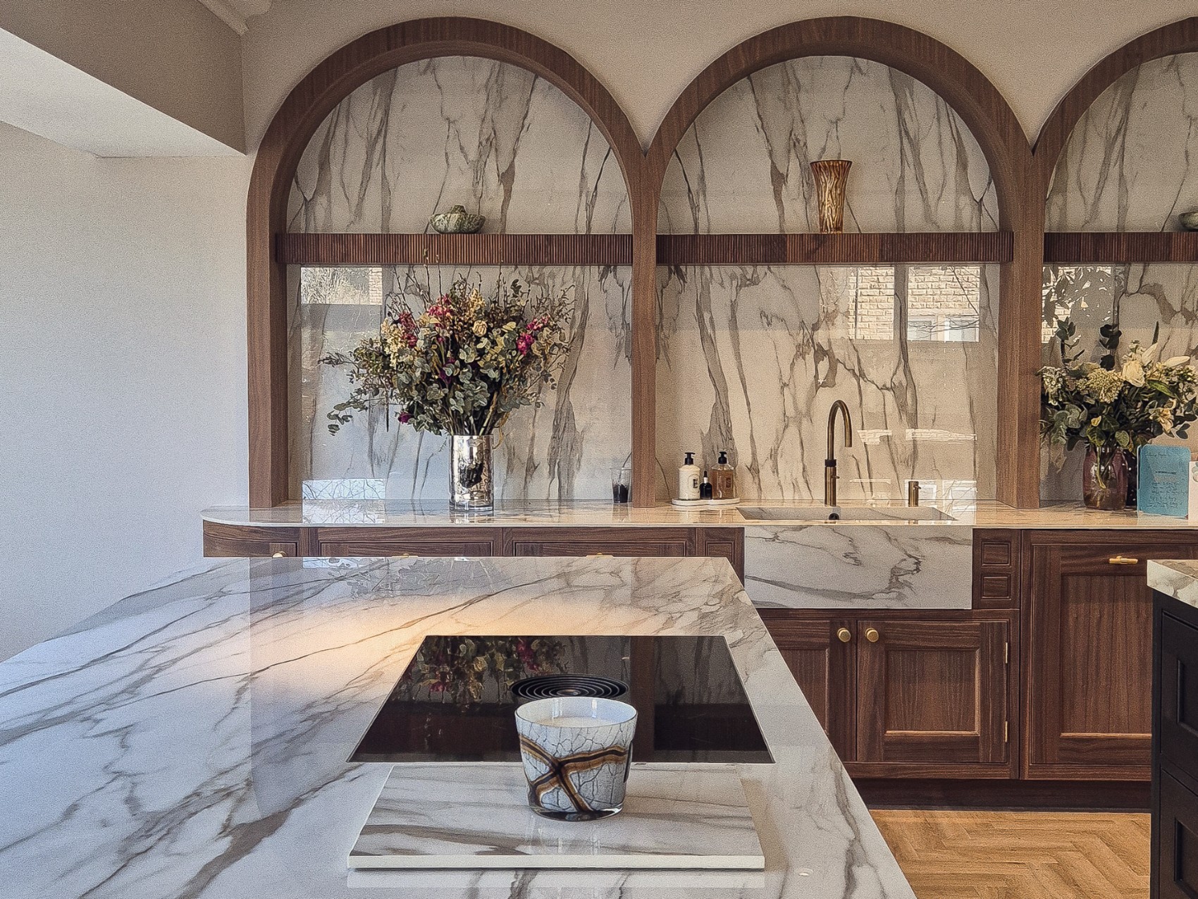
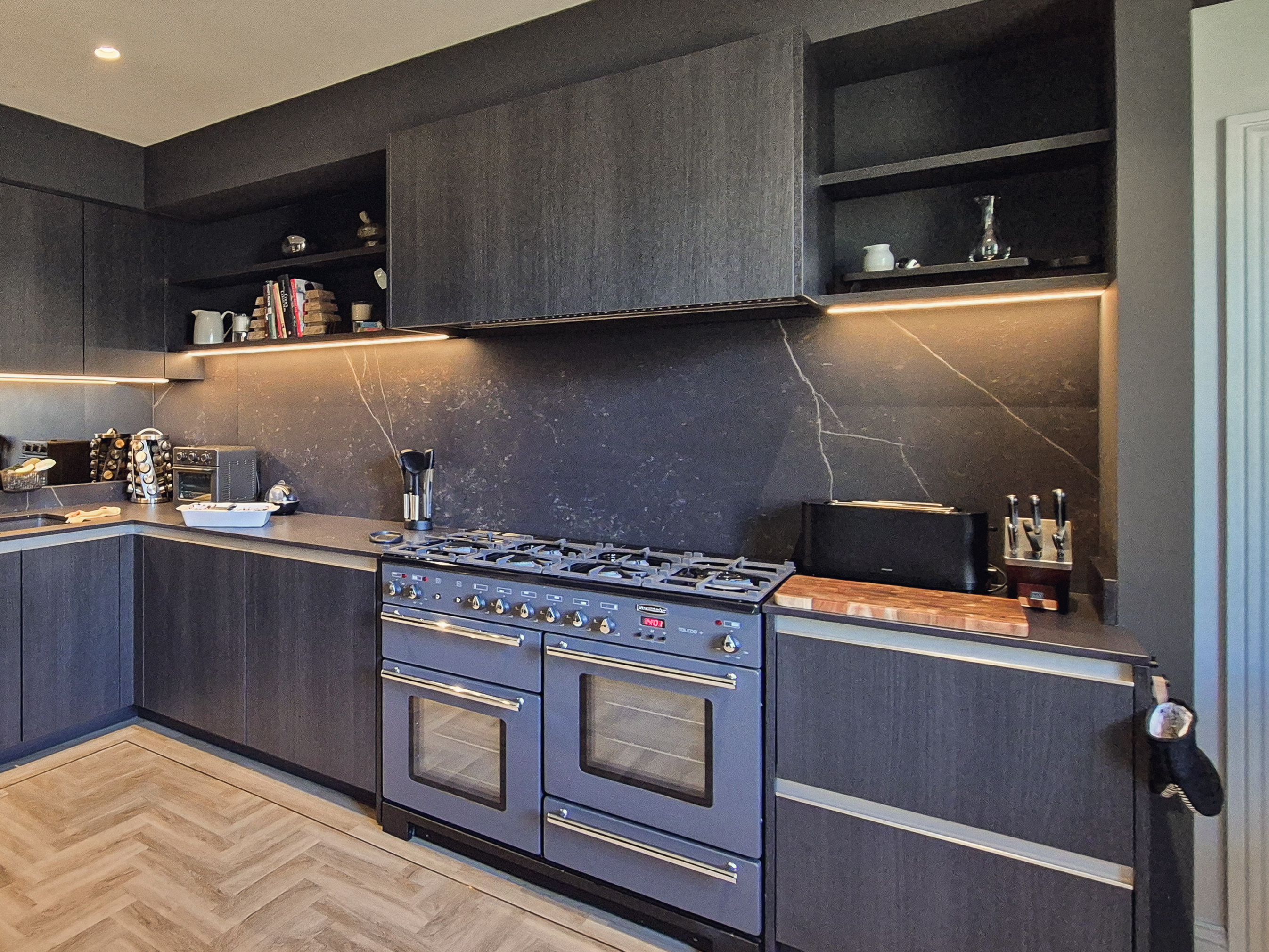
at the heart of the layout is a kitchen by Grid Thirteen, winner of Best Luxury Kitchen (North) at the 2026 Designerati Awards North, and now through to the national shortlist. it was a true collaboration: we designed the architecture as the set, and Grid Thirteen dressed it. the arched marble bays, the ceiling heights and the fall of daylight were all shaped to give their cabinetry a stage worthy of it, space and kitchen conceived together, each making the other look its best.
05
an architectural rain chain
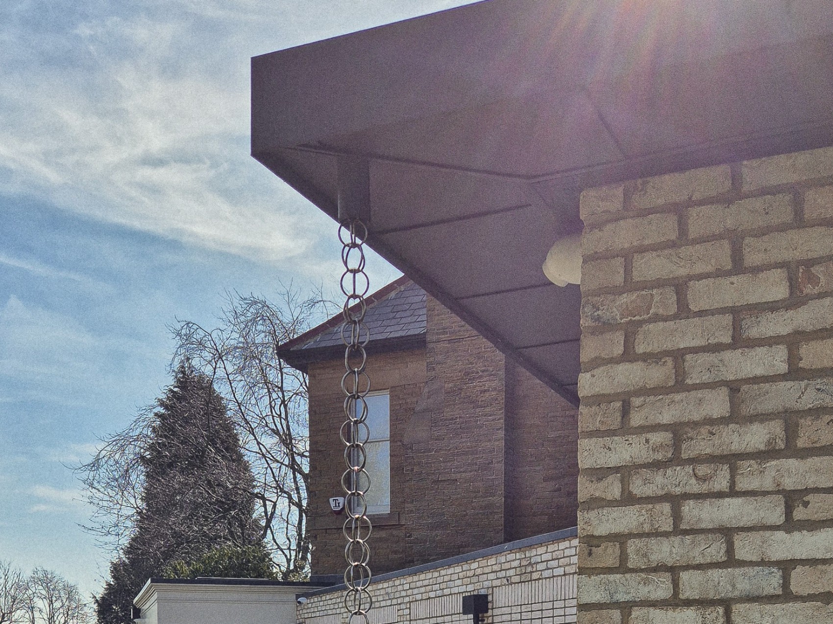
in place of a conventional downpipe, a sculptural metal rain chain (kusaridoi) acts as a functional water installation on the primary brick pillar. it channels rainwater down interlocking rings into a hidden drainage base, a quiet, tactile detail on the building's exterior.
06
a traditional orangery to the side
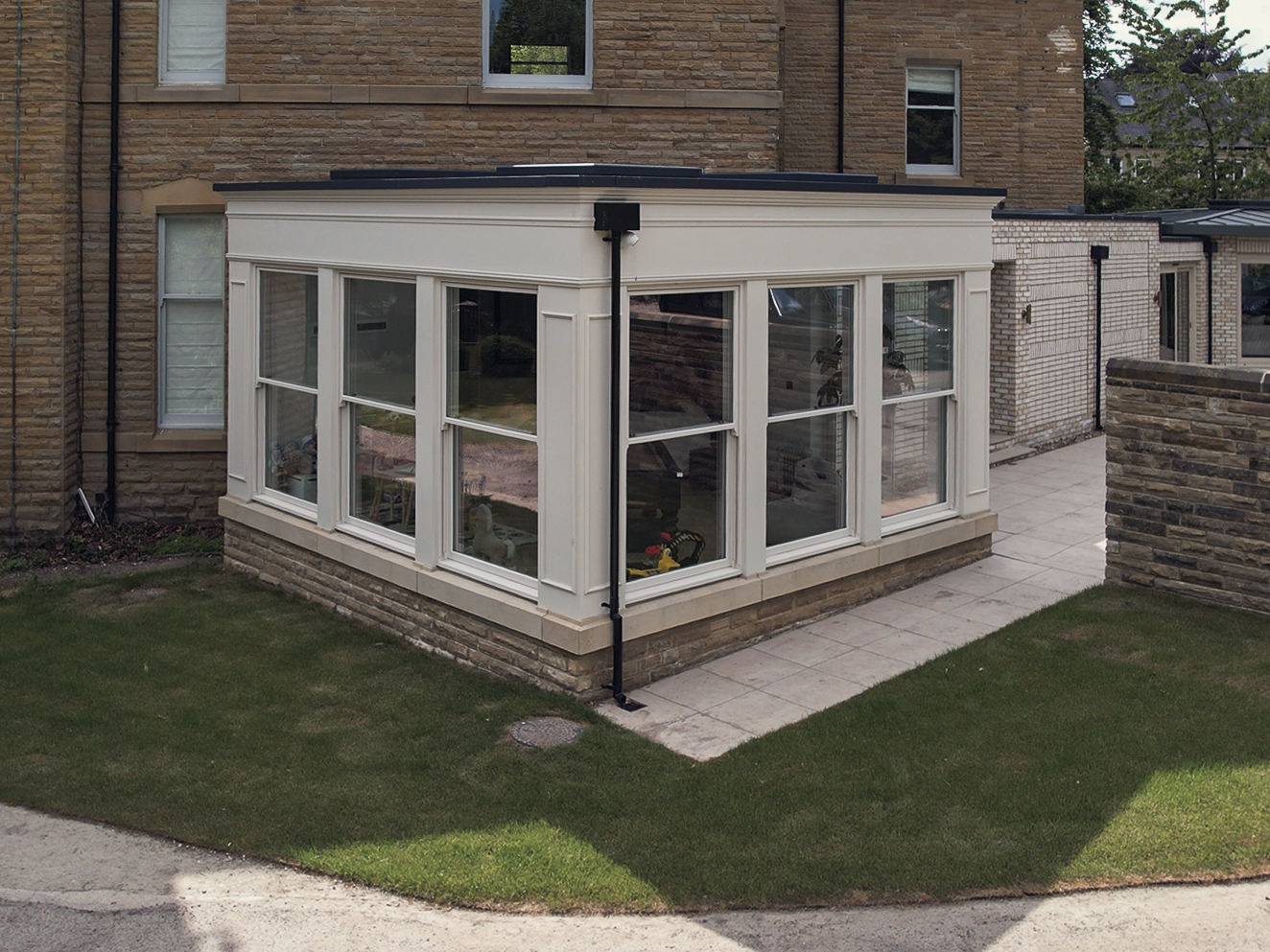
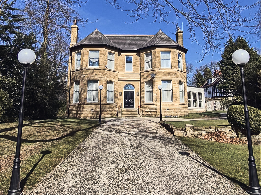
the two additions were designed as a deliberate pair. at the rear, the pavilion makes its own contemporary statement, all glass and light, dissolving the line between inside and garden. but the wing that faces the road is a different conversation entirely. here we kept an orangery in a purposefully traditional idiom, so it would sit quietly alongside the amazing victorian frontage rather than fight it. where the pavilion celebrates the connection between inside and out, the orangery defers to the house it belongs to, two moves, each right for where it stands.
"we were asked for a side extension. we gave them a new way to live in the house."
a closer look at the pavilion, the kitchen and the original house.
common questions _
What was the brief for the garden pavilion, and how does it connect to the main house?
The brief was a better layout to the rear of the house for a young family who wanted a sense of luxury. We gave them a pavilion that connects them to the nature around them and a place to relax as part of the kitchen, a room where every part of family life can happen. Alongside it, a side-extension orangery gives them a space for large gatherings, from hosting Christmas dinner to closing down into a dark room for family cinema nights.
How did the design earn its place in The Times?
As part of our collaboration with Grid Thirteen, our architecture set the stage for their designers to work their magic. The placement of windows and rooflights gives the kitchen the same visual access to the garden as the pavilion, and paired with natural tones and arches that bring a real wow factor, it brought the whole space alive. The completed extension was featured in The Times as 'The Architecture of Luxury'.
What makes the space work so well for the family?
We would not single out one room as the heart, the whole space is. It all works together and flows perfectly for the family; the architecture and the interior are singing from the same hymn sheet. That coherence is what makes it feel special, rather than any single feature.
How does the pavilion handle light and the transition to the garden through the seasons?
The rear of the house is north-facing, so getting light in mattered enormously to the client, the original small openings never worked and the lights were always on. The pavilion opens the space to the light and the views out to the landscape, but its roof overhang alone would not carry daylight to the back of the room. We solved that with well-placed windows at the junction between the pavilion and the kitchen and a large north-facing rooflight, because it faces north, it floods the space with even light without the heat.
have a home worth transforming? _
the best projects often start smaller than they finish. tell us what you're thinking and one of us, andrew or jack, will get back to you within two working days.