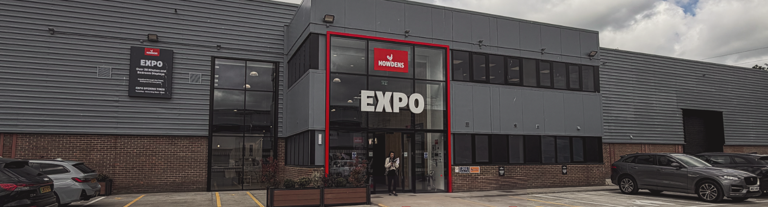
shaping how the expo presents itself to the world.
we led the concept and the visual identity for the Howdens Expo. the job went past the building itself, it was about giving the brand a physical form people could walk into.
the spatial sequence, the materials and the way the building meets the forecourt were all worked out to make arriving feel open and deliberate, you read what howdens is the moment you pull in.
five moves that turn a trade facility into a brand landmark.
01
collaborating with the howdens design team
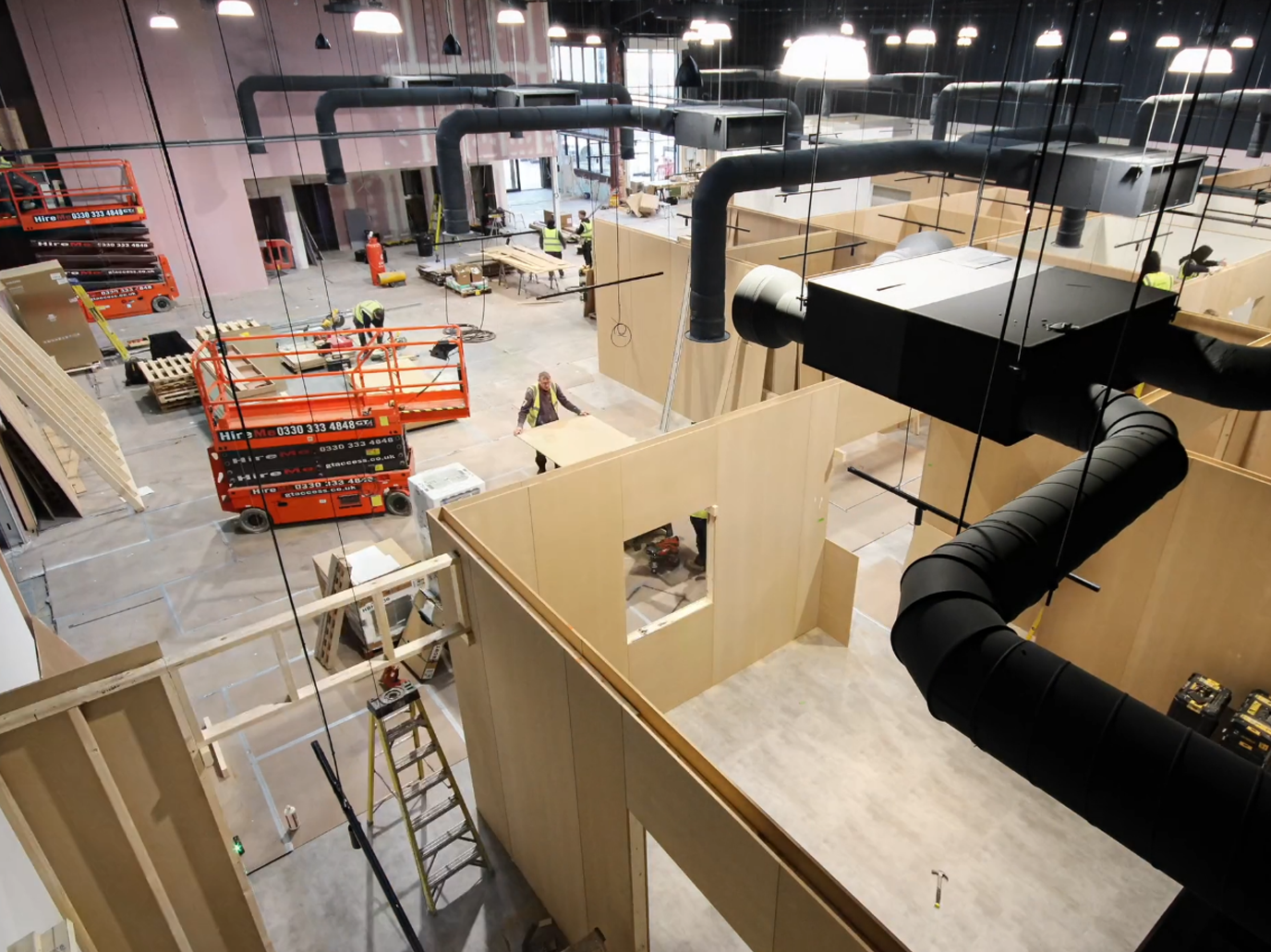
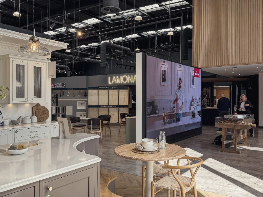
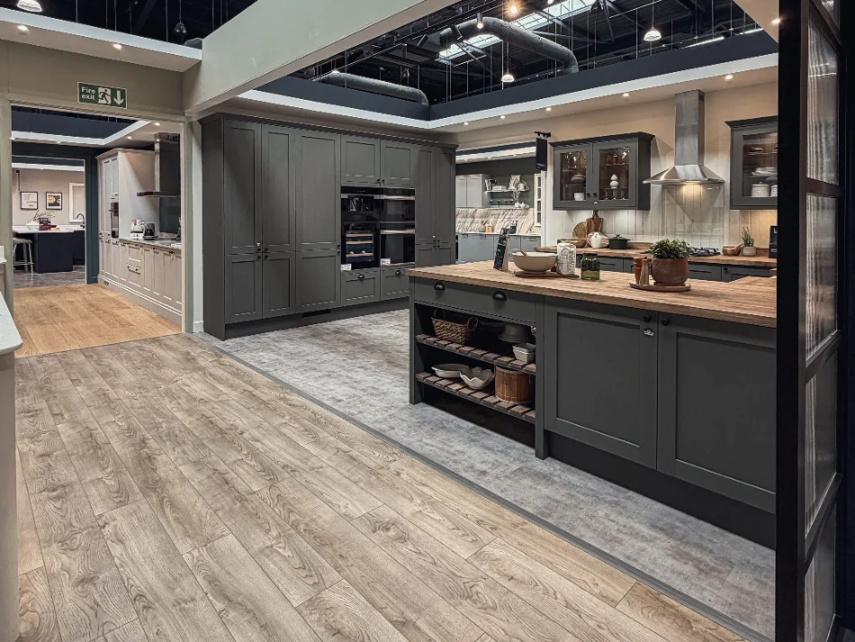
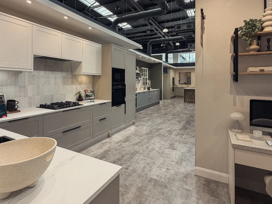
the heart of the expo is the internal space, the kitchens and how they are presented. we worked in close collaboration with the howdens design team to get this right, coordinating with the contractor to make sure every display space was built exactly to suit the kitchens it would hold.
02
the glazed expo beacon
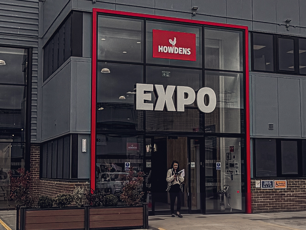
the two-storey glazed curtain-wall entrance is the building's focal point, framed by bold red composite panels so it works as the brand's signature from the road. the glass pulls light deep into the exhibition hall and makes an open threshold to walk through.
03
every other space, designed by us
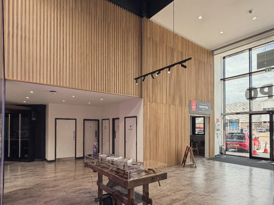
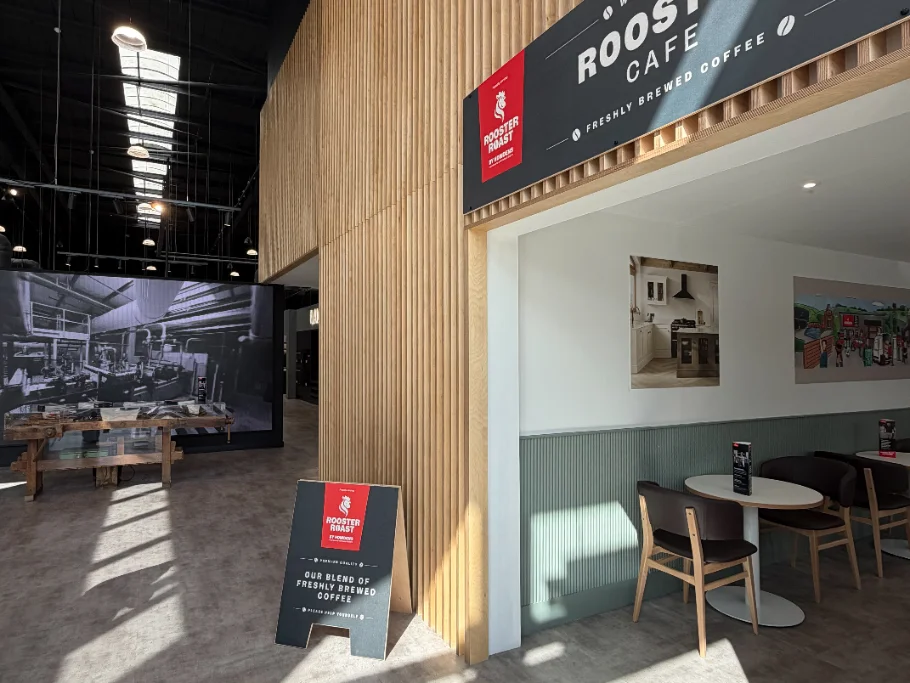
beyond the kitchen displays, we designed all the supporting spaces, private areas for staff, and a feature wall of vertical ply slats greeting visitors at the entrance. by working with the existing warehouse volume we gave howdens everything they needed back-of-house while freeing up as much floor area as possible for the expo itself.
04
the product, everywhere
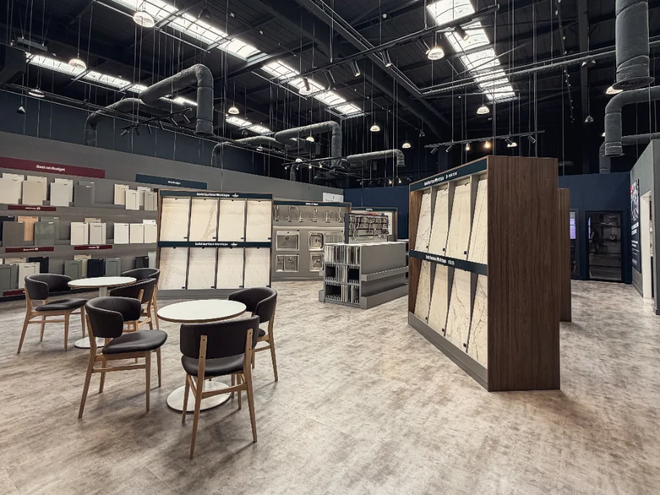
highlighting howdens products wherever possible is key to this space, not just in the showroom, but through the back-of-house areas too, so the quality of the range is felt in every corner of the building.
05
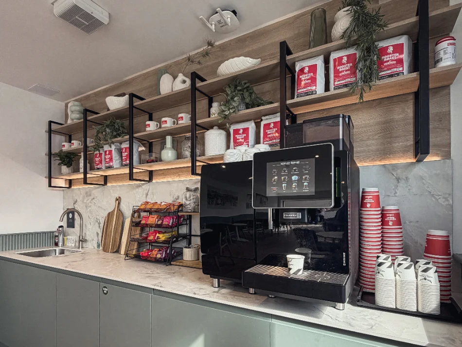
a last-minute rejig: roosters coffee
a late change to the layout made room for a roosters coffee spot, somewhere for customers to pause, coffee in hand, and think about the amazing kitchens they've just seen.
"architecture and identity, detailed as one, so the building doesn't just house the brand, it is the brand."
a closer look at the finished facility, inside and out.
common questions _
What was the brief for the UK's first standalone Howdens Expo?
The brief was to create something different from the trade centres, but with the Howdens identity still at its core. They had run expos elsewhere in the country, but never as a building of its own with its own identity. Drawing a single, clear identity out of a company that big, with so many sides to it, is difficult, but we found a way.
What does it mean that you delivered both the architecture and the brand identity?
The facade and the identity come hand in hand. The way the externals look here become the base print for the rest of the sites if they choose to roll it out. How you enter, and the fact that large glazing now offers a view into the culture and design of Howdens where the trade counters were closed off, we needed to create that open identity and let people see behind the curtain. So the architecture was intrinsic to the identity. We were also working with an existing building, so planning and what would be allowed came into play too.
How does the building work as a tool for Howdens' trade customers?
Customers can now come in themselves and see the kitchens fully set out as they would be at home, more open and inviting, and available to touch and feel the craftsmanship. Part of an architect's job is understanding what a company is and what it means to people, and it was important that the craftsmanship of the architecture stood up to what has made Howdens the juggernaut it is in its own industry. That is a lot of pressure on a designer, and we feel we managed that and more, especially as a small studio in Morley.
What made this a landmark project for the studio?
Working with such a well-known company, and leading, alongside their brilliant teams, the new chapter they are heading into: a front-facing, customer-led business with the trade still working hard in the background. What two-person, director-led studio would not want that?
got a commercial project in mind? _
from trade facilities to workplaces and hospitality, we take commercial work from first concept through planning and brand. tell us what you're planning.